Hello! My name is Emily, and I am a graphic designer born and raised in Wisconsin.
Work
Fruede Jewelry
Fruede Jewelry is a branding project that spanned four months, during which I created a plethora of different brand assets.
Personal Project
In this project, I created a fan cover of the popular series Wings of Fire as an homage to my love of the fantasy genre.
Pantone Swatch
By selecting a Pantone swatch and a design-related word, I created a cohesive collage that incorporated the selected color as a central element.
Sticker Sheet
With both humor and adorable icons, this project was designed to be marketed toward cat owners and cat lovers.
Sprinkles Website
The Sprinkles website project was a website coding and design project with a focus on modern responsive design
Travel Magazine
As my first project in Adobe InDesign, this travel magazine was a fun dive into layout.
Movie Poster
In this project, we were tasked with creating a parody poster of a randomly chosen movie.
GWD Logo Design
In this project, students of the GWD program were challenged to design a new modern logo for the program to be used on their social media and in other printing.
About
Emily is a passionate graphic design student with a keen eye for creativity and visual storytelling. Originally from Platteville, WI, she has a strong foundation in design principles, typography, and digital illustration, and is dedicated to crafting compelling visuals. She has an interest in motion graphics and logo design. Always eager to learn and grow, Emily stays updated on the latest design trends and strives to push creative boundaries.
Contact
Feel free to contact me using one of the methods below!
Fruede Jewelry is a large branding project that spanned the entirety of my fourth semester. After creating a strong fictional brand, we were tasked with creating various assets for the brand such as a logo, logo intro, mockups, packaging, etc. Designed to force students to work with continuous brand themes, we worked in a variety of programs to design these brand assets.
First, we created a branding board for our company. Fruede Jewelry focuses on maintaining high quality while being more affordable than traditional jewelry companies. I chose this collection of elegant but approachable fonts to communicate this. I spent a lot of time creating variations of the logo. To start we decided to create a logo that would be very different from the traditional jewelry company. They are normally just black, or with only one color, so we created a gradient with the company colors. Then, we overlaid a gem facet pattern which adds more variety and interest and relates to the company.
The next phases included mockups and packaging. I created a repeatable gem pattern for use here and created a few strong design trends which will be carried through the rest of the project.
Personal Project; Book Cover
As someone interested in digital art for many years before school, I have built most of my design skills in art through the digital medium. In the particular project shown here, I created a fan cover of the popular series Wings of Fire as an homage to my love of the fantasy genre. Created with the composition of a book cover in mind, I designated areas to the jacket flap, cover, spine, and back cover. I also focused on creating an overall pleasing image with a story to draw the audience in.
Pantone Swatch
This project challenged me to explore the relationship between color, theme, and visual storytelling. By selecting a Pantone swatch and a design-related word, I created a cohesive collage that expresses the essence of my chosen word while incorporating the selected color as a central element. Created using Illustrator and Photoshop, I used a variety of photos to give a sense of texture to the piece. The cohesiveness of the photos when looked at as a whole contrasted the individual photos and scenes themselves, meant to draw the viewer in.
Sticker Sheet
With both humor and adorable icons, this project was designed to be marketed toward cat owners and cat lovers. Created in Illustrator, these stickers were made with a few cats in mind. In particular, I based them off of my family cats Sugar and Spice, and my roommate's cats, Mary and Fuzz, the latter of which lives with us and was a great inspiration for me.
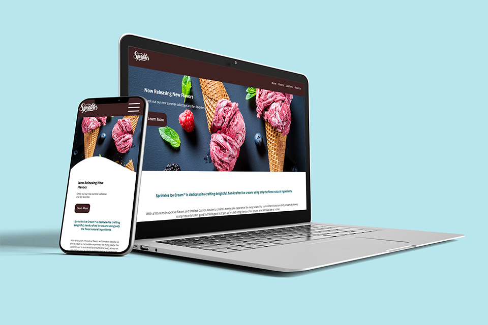
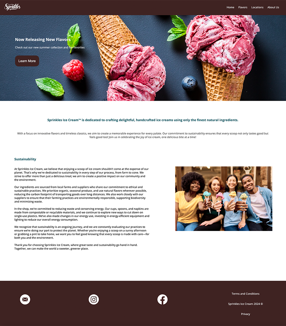
Sprinkles Website
The Sprinkles website project was a website coding and design project. With a focus on modern responsive design, I created a few different layouts for each screen size. We designed the website layout on Adobe XD, and then coded the HTML and CSS on Adobe Dreamweaver.
Travel Magazine
Our first project in Adobe InDesign, the travel magazine was a fun dive into layout. Instead of the typical destinations, such as Prague or Paris, I chose my destination focus to be on a fictional tour of the Mariana Trench, with a humorous focus on the uninhabitable traits of the deep sea to contrast the magazine's attempt to gain tourists.
Next, we created several different-sized advertisements for the destination and tour. I used a central theme and repeating images to follow the brand identity already established.
Movie Poster
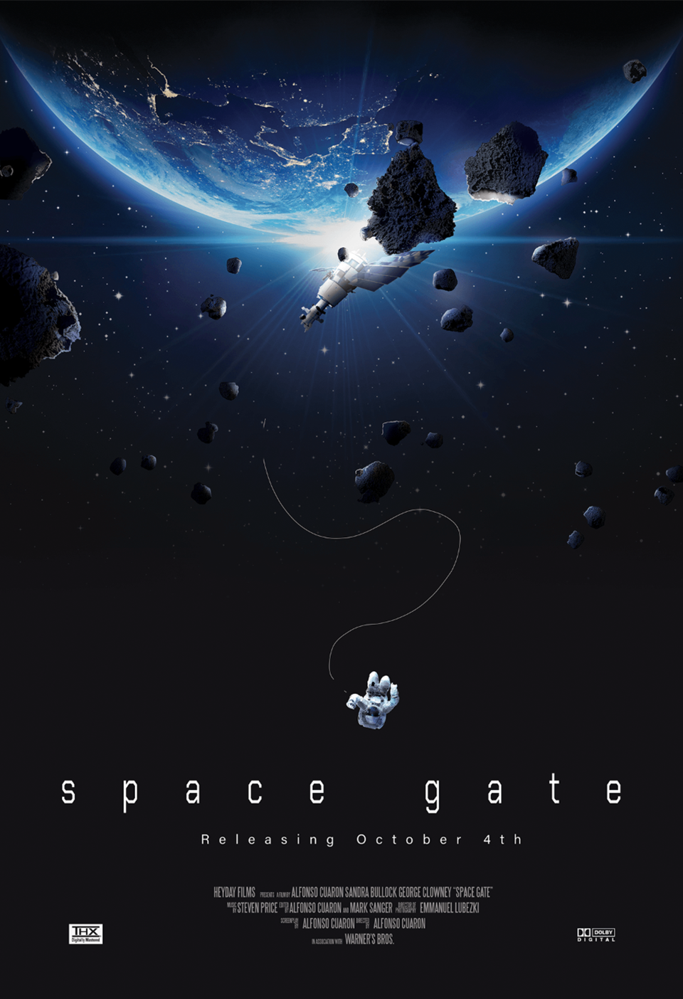
In this project, we were tasked with creating a parody poster of a randomly chosen movie. My movie was the 2013 thriller, Gravity. I created my poster in Adobe Photoshop using Adobe Stock assets by blending them into a larger composition. It was designed to elicit the same feeling of helplessness in the story as the original movie and draw the audience in.
GWD Logo Design
In this project, students of the Graphic and Web Design program at SWTC were challenged to design a new modern logo for the program to be used on their social media and in other printing. This logo was created in Adobe Illustrator. I used large bolded text to contrast the small and thin text at the bottom and included a mouse icon clicking to help sell the digital feel of the program.